Worked really well today…
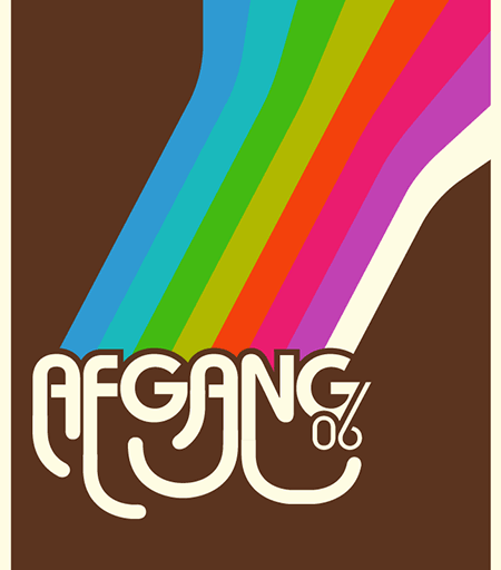
I took a big decision to re-make the front page of the web site, to make it more coherent with the rest of the site and the poster. In the proces I solved a problem: Earlier in the project, we tried to figure out how the masks for the transitions should look. That’s all figured out now :)

This screen is just the bottom part of the larger poster (350 x 800 mm) –> slim and sexy :p
Tomorrow I’m going to place the remaining INFO-text and then place all the elements in Photoshop to throw some dirt on the whole thing *yummy*.


 Tillykke Line


