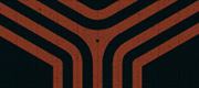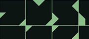


Click it bigger to see the details.

Holy sh*t it’s late! 04:15 a.m. to be exact, and I’ve been playing around with this font all day and night. I wanted to create en extremely geometric typeface, and this is the result (it’s called “Stackable”). Yeah, I know that there are a bunch of similar fonts out there, but I mostly did this to get more practice with FontLab and the designing of fonts.
The concept of this typeface is pretty simple. I used triangles to “carve out” each letter and that’s that. The challenge was to make fairly recognizable letters. It’s not the most readable font in the world, but it’s primarily meant to be used for “illustrative” layout of typography. I think it might look cool on a t-shirt.
I’ve been recording the entire process, so sometime tomorrow I’ll post a tutorial on YouTube and embed it into my blog. Stay tuned if you want some behind the scenes for this one. Right now I just gotta get some sleep!
 Tillykke Line