Since Marcus Stade from Sweden is reading this, I’ll do it in English.
It feels really good to finally have found the name for our company. Now we can focus on the logo, logotype and the rest of the identity. We’ve spend SO much time brainstorming on a name, that IGOR would be envious, hehe.
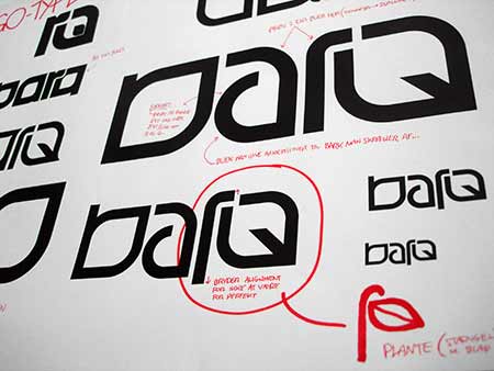
Anyway, here are some sketches from today:

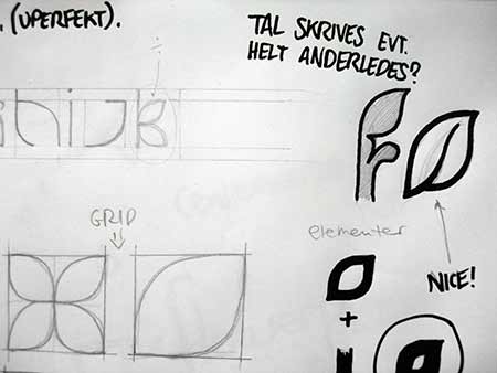
I’m trying to get an organic feel to the logo, so I’ve been experimenting with the shape of a basic “leaf” for each letter.


The “leaf” shape could be used for a font. I’ve tried to sketch on that a bit to see if it might have some possibilities. It would be absolutely awesome to have a custom font for our identity. Might not be suited for “placeholder text”, but rather for headlines.

Here’s an “a” that I’ve tried to boil down to a simple shape. In general Anders and I like to keep things simple – even though we always end up with quite lengthy Keynote presentations, hehe *cough*90 slides*cough* :p


 Tillykke Line


One Response to barq (sketches)