
Close-up of the title. I used the font Feast Of Flesh (italic).
You can get the font right here.

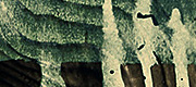
The hole in the roof was really fun to do. The wooden bars under the tiles, are actually a piece of the fence that I've stretched out and scaled to fit in this new context.

What's a ghost house without a scary looking spirit in the window?

Darn it! Who left those bloody smudges on the stairs?!

This is something you don't wanna have: the one and only thing that separates your house from the graveyard (the fence) is broken!
Back in Kolding after having taught at Rødding Højskole for three weeks. I had a great time there, and once again confirmed to myself, that teaching really forces you (the teacher) to study the software more than you would normally do. I’ve been teaching Adobe Illustrator, Photoshop and Flash / After Effects, so I’ve been quite busy structuring schedules for each day. The cool thing is, that all the material can be re-used for next time!
I spent a great deal of time on preparing a project in Photoshop for the students to try out. Basically it’s a matte-painting where a regular victorian-style house is transformed into a ghost house!
The images above show the before and after stage of the project. Slide your mouse across the image, to switch between the two stages! Credits to Jonas Drotner Mouritsen for lending me the Flash file, which is originally used here.
I’m planning on making a series video tutorials based on The House. That would be kind of fun.

 Tillykke Line


9 Responses to The House: Before & After