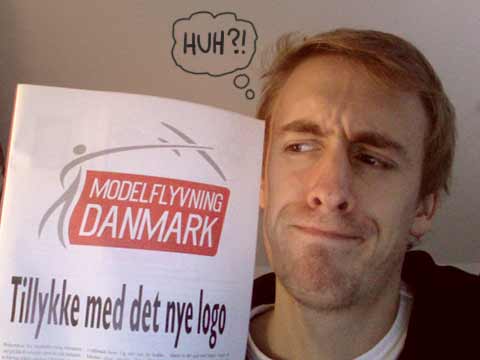
A while back, I entered a competition of designing a logo for the merging of three different model airplane unions. This was my entry for the competition. Now the judges have voted and the winner has been found. Take a look at this:

I have no further comments...
I was among the 20 finalists, so at least that’s a little bit comforting. But seriously though… It puzzles me, how the judges could pick a logo like this. It looks like it’s been beaten with an ugly stick and then thrown in a pile of fecal matter (pardon my French!). I just need to air my frustration, because I spent DAYS designing my entry for the competition, and this looks like it’s been put together in half an hour… Oooooh the injustice! The pain! But what do YOU guys think about the winner? Maybe it’s just me who dislikes it?


 Tillykke Line


6 Responses to Winner found…