This is by far the longest post I’ve EVER posted onto my blog!
Friday January 25th, my friend Anders and I went to a Scott Hansen / ISO50 workshop in Stockholm – “Blending Analogue & Digital“. It was arranged by SMUG and Grafiskt Forum and sponsored by Adobe and Gimlet. The workshop started at 18:30 and was scheduled to end at 20:30. Afterwards there would be some mingling and poster sale. This is the story of how Anders and I made it to this once-in-a-lifetime workshop with the talented graphic designer Scott Hansen…
[ January 24th ] Design:Startup course from 09-15.
[ After the course ] Running around town preparing stuff for the trip to Stockholm. Cashed some money in the bank. Bought paper for the business cards. Etc. Didn’t have the time to sleep after the course like I had planned because of all these errands… I think it’s gonna be a tough trip to Stockholm, worth the effort I’m sure!
[ 19:02 ] Packing for the trip/workshop – making sure everything is charged and that I’ve got the most important things in the bag: passport, wallet etc. Also checking to see if Anders remembered the tickets! Forgetting to bring those would just be the worst thing ever!
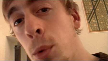
Playing around with the DV-CAM trying to do a short update for the vlog. Notice the ISO50 poster “1971” in the back ;) And next to it is two more…
[ 22:00-ish ] Printing at the school. Anders just got his cards printed in time before the alarm went off. What a rush! I really hate it when that happens, hehe. My cards came out great, even though I had to do like 50 test-prints before the darn printer would overlay them correctly (front against back)! When are they gonna get a duplex printer?
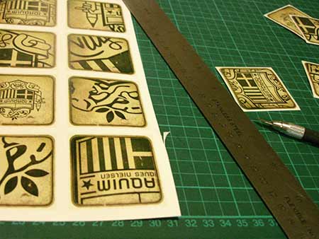
Here I am cutting the little devils into separate cards + rounding off all the corners manually (and yes, of course you can tell by the output!)
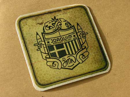
There it is :) The worlds first beermat business card…
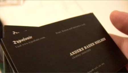
This is the business card of Mr. Baden. Black and minimalistic as always :p Gotta love that ninja-action right there.
[ 00:31 (January 25th) ] Anders and I just printed our business cards at school, and now we’re home at my place for a short while before going to the train station here in Kolding. Train leaves at exactly 01:00.
[ 00:47 ] Arrived at Kolding station. Bought our tickets for Kastrup (only 144 DKK)
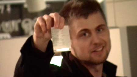
“Is that what you lookin’ fo, huh?”. Bad ass!
[ 01:05 ] In the train to Fredericia.
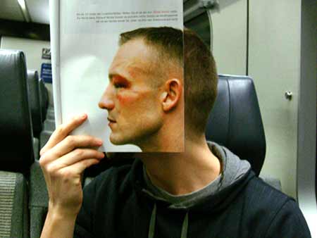
We met a celebrity boxer (Kessler). What are the odds!
[ 01:30 ] We’re “stuck” at Fredericia station having to wait there for approximately 1 hour and 45 minutes for the train to Kastrup Airport at 03:06 (track 10). We tried to get some sleep on some wooden benches inside the waiting hall.
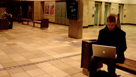
Mr. B. typing away on the 17″ while I wander about the station, shooting weird pics with my cam (see below). Everything was quiet except for this monitor going: “beep beep beep beep beep” every 30 seconds or so. It really added to the ambience of the room. You know, usually you’re used to places like train stations to be crowded with people, so when they’re not, it kind of feels like you’re the only person left in the world or something. It’s the weirdest feeling.
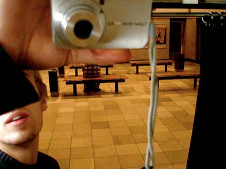
Yup, that’s the weird pic right there. As you’ll notice, there’s actually a guy sitting right below the cam. He was kind of sleeping I guess.
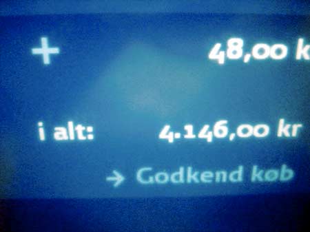
4.146 kr – Nah, I guess I don’t really need 250 tickets to Kastrup, hehe
[ 03:15 ] Finally in the train to Kastrup. The train is loaded with people sleeping and there’s a funny smell – a crazy mix between hot farts and wet socks.
[ 06:00 ] Arrived at Kastrup Airport. We now have 1 hour to check in and get on the flight for Stockholm.
[ 07:02 ] In the airplane ready to take off.
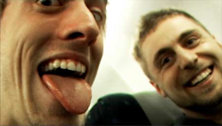
A bit nervous before take-off.
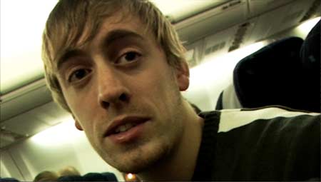
Live from the air. Anders is interviewing me about my expectations for the workshop (yet another clip for the vlog!).
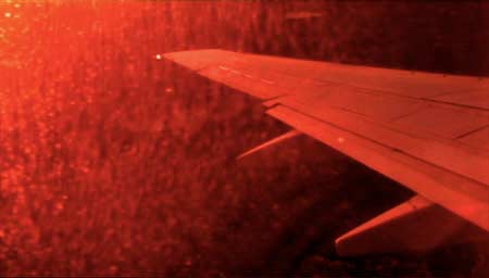
About to land. I was lucky to catch this awesome snapshot of the wing being lit by the rising sun at approximately 4.000 meters altitude (just a wild guess). Credits to the captain for letting us have the sunny side of the plane :D It was the single most beautiful thing I’ve ever seen.
[ 08:37 ] Arrived at Arlanda Airport, Stockholm.
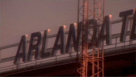
[ 09:12 ] Finding Sky City. Rest & Fly – a place to get some sleep! Checking out prizes for Arlanda Express Train on the way. Really expensive! 331 DKK for 20 minutes by train to Stockholm City.
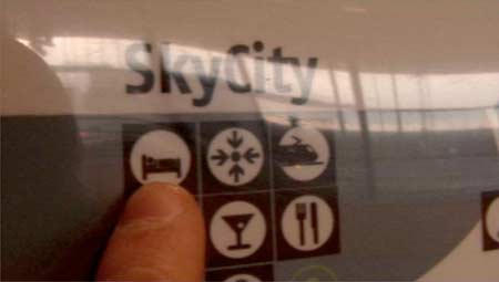
Gotta love that name: “Sky City”. It has a certain futuristic ring to it that I like… but it also scared me, haha. Especially when we walked through this crazy multicolored tunnel to get there… Trippin’ :p
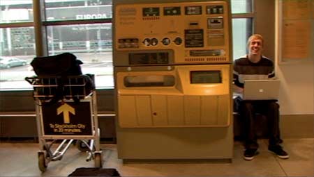
[ 10:15 ] Rest & Fly until 15:00.
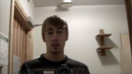
This is me trying vlogging in front of the mirror in the tiny (yet comfortable) Rest & Fly Arlanda Airport mini-hotel. Still kind of tired, even though I managed to get a couple of hours sleep…
[ 13:52 ] Woke up an hour earlier than planned. Anders’ iPod was set an hour earlier… damn it.
[ 15:05 ] In the Flygbus to Stockholm City. About a 40 minute drive but a lot cheaper than the Arlanda Express Train.
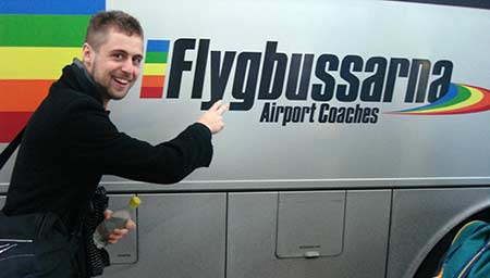
“Airport Coaches” – For those airports that are trying to find their goals in life, hehe. I wonder what Airport Coaches charge pr. hour…
Inside the Flygbus!
[ 16:00 ] Finally in Stockholm City! We’re headed for the nearest place to get something to eat, and then we’ll go to Clarion Hotel Skanstull by metro (green line).
[ 17:30 ] Outside Clarion Hotel. Just one step from the ISO50 workshop! Feeling kind of nervous but glad and relieved that we made it here :)
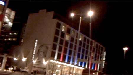
This is the Clarion Hotel. We made it!
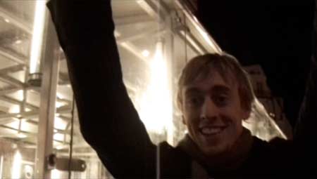
Yes! That’s the look of a guy who’s about to meet his greatest idol.
[ 18:30 ] WORKSHOP!
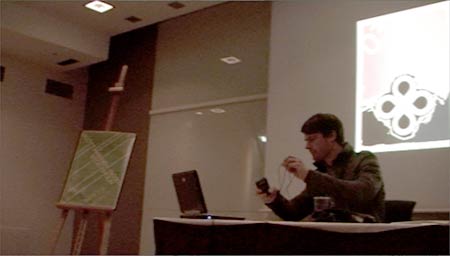
Mr. Scott Hansen (ISO50 / Tycho) in person! I can’t believe that I’m sitting up front like that. This is what we came all the way to Stockholm for, and now it’s happening!
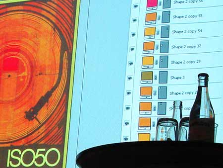
Looking at layers and everything! It was truly an honor to be able to get a glimpse of how he works in Photoshop. Something that pretty much sums it up (but then again not): AN INSANE AMOUNT OF LAYERS!
=============[ SEMI-TRANSCRIPT ]=============
I’ve tried to pick out some of the things Scott Hansen said at the workshop – things that I personally find very interesting (which is pretty much everything, hehe). This thing is sort of like a “semi-transcript” of the first part of the workshop – just the “preface” part and not the actual “hands-on” part. Here we go:
It was really cool to get to know his background. He told us that he started out as a designer kind of indirectly as a software developer. He studied software engineering in college, and then ended up going into interface architecture. He said:
“I’ve always been really interested in visual communication, design and illustration and things like that, but I never really thought I could make a career out of it.”
Then he went on about how how he got started with learning Photoshop during his work at a software developing company (I didn’t catch the name of that though). At the same time he was a musician, so he would also be designing album covers and posters for shows, which is what made him fall in love with computer-aided design. He said:
“Up until then I’d be doing everything in pen and ink and traditional methods. Once I really got my head around Photoshop and realized how powerful all these things could be, it really opened my eyes to this new medium and this new way of looking at art and that’s really when I decided that that’s what I wanted to do for a living. I wasn’t sure how I was gonna do that, but I decided that I need to start on that direction.”
After having worked for various software developing companies (doing really bad designs for them: web, back-end stuff, interfacing etc) he moved over to an agency called Buckwild about 5 years ago:
“They did a lot of kind of cutting edge web stuff for artists and the music industry, so it was kind of a chance to be a little bit more free with the design spec.”
At the same time during all this, he was developing ISO50 – a personal portfolio for experiments and for posting all the show posters, which, he told us, is his favorite thing:
“You have these constraints because you have to communicate this information. You have to communicate the time and date and let them know what’s going on, but at the same time try to make this thing that you feel is beautiful or is art. So that’s what I think really turned me on – and album covers too!”
Back in Sacramento, Scott met the musician and flash developer Dusty Brown (also founder of Buckwild). They started working together on flash websites through Buckwild. At that point Scott really got into flash and the idea of taking flash interfaces and making them really usable – making flash these built in experiences.
At this point ISO50.com got more recognized, and through that, Scott was able to get some work at Computer Arts magazine. Working at Computer Arts really helped him evolve his style. He was able to push past what he had been doing before that (local clients and stuff he couldn’t go crazy with). Computer Arts had much more open specs.
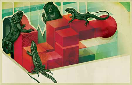
Every month when Computer Arts did a “Test” of some product (printers, software or whatever) Scott would create and illustration for that particular test. This one was for 3D modeling software, and as Scott said:
“If you didn’t have the text on the page you wouldn’t know what they were for”
So Computer Arts were really open and let him go crazy with the illustrations.
Working at Computer Arts, Scott really learned how to make his proces more efficient and how to figure out what he was going for – building a style that he wanted to be unique to him. He sort of built a toolkit of effects. During the time at Computer Arts, he was developing a lot of really heavy distressing techniques.
Looking back, he thinks that some of those effects might have been a little “overdone”, but Scott believes that that’s how you learn – Basically it’s just all about trying out a lot of different style, effects and techniques and then gradually trim them down to match what ever expression you’re looking for in your work.
An essential part his work, Scott’s says, is “the ability to make things feel a little bit deeper“. To achieve this, he has developed a lot of analogue techniques to make the digital output look at lot more “real world” as he put it, by using real objects in his illustrations. I guess some keywords for his work would be: organic, layers, texture, overlay modes, shadowing, shading etc.
One thing he has never really liked is “digital perfection” – creating perfect lines and perfect color fields which you’re able to do using computers. This is one thing that I can relate to myself, which is why I like his style so much. It’s sort of like a “rebellion” against the digital age the way I see it. A counter-action against the soul-less computerized art… or something like that. Obviously he is way better at describing his work than I am, so I’ll just be quiet for now!
He left Computer Arts and Buckwild and went freelance, dealing directly with the clients:
“When you’re dealing directly with clients, its not just supposed to be this fun two-page spread. It has to be kind of along with their specs, so it really educated me on how to compromise – I really hate compromising, but you know, you gotta do it sometimes”
About 2 years ago he went and spent some time at Adobe (inside the consulting group) doing interface related work for six months – kind of going back to his roots and what he started out doing. He didn’t last there long though, because of all the constraints and parameters of the giant corporation. He just knew that it wasn’t what he wanted to do.
Ever since Adobe, Scott has really been focusing on his musical output, trying to bring his designs along with that and evolve as a designer by supporting his music with his designs.
When creating graphics for his live performances, he basically just breaks down and animates his designs so they mix together. He feels that his music and his design both feed on each other, and he wouldn’t know what to do if he didn’t have one of the other. Scott kind of bounces back and forth between design (ISO50) and music (Tycho). He sees them as two very similar processes.
His music can be described as electronic although there’s a lot of real world elements in there. As for his designs, it’s kind of the same thing. He showed us one of his posters and said:
“You’ve got a poster like this, and a lot of it’s computer generated, but you know, maybe 40 percent of it is actually real world stuff that’s been photographed and scanned”
He compares the layers in Photoshop with the concept of tracks in music. He loves working with the two, so when he gets burned out on design, he works with music and vice versa. Lately though, he tells us, he’s been able to work with them pretty much simultaneously as a singular thing by making an album cover for a project that he’s working on at the moment. In other words I guess he’s unifying the two.
I was surprised to hear that Scott is trying to get acros this “vintage vibe”. He doesn’t want to be associated with a trend like that or “retro” because like he said:
“Once the trend is dead, you’re pretty much dead with it, so I’ve always tried to steer clear of that, but at the same time I wanted to develop my own personal style that I cuold be identified with, so I spent a long time kind of growing with that style (vintage) kind of going back and forth, but I spent probably the last year or two, not trying to move away from it, but trying to […] focus in on it a little bit more and make it something a little bit more less obvious and less over the top”
Then he said an interesting thing about wanting to create timeless pieces:
“I think when i was younger i was all about taking the effect and go all the way going crazy with it, so i’ve just been trying to [*] that in and be a little bit more classical with my design and hopefully be timeless with some of the pieces, and so in 20 or 30 years I’ll be able to look back say: okay you know, that’s as well today as it was back then and it still looks good you know, it’s not obviously dated or anything like that”
* That part was lost in the audio recording, sorry.
He went on and told us a bit about the show poster he designed for the workshop. He likes to keep it in a modernist ethic, which is the way he looks at information design. He especially likes the Olympic posters from around the 60’s – Otl Aicher (Flickr search) and that whole movement.
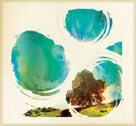
Though, when he’s designing covers for his music, he likes to go for a more organic vibe, trying to make it feel almost like a painting as opposed to somethings that’s obviously considered graphic design.
It actually surprised me to hear that he considers himself that much of a perfectionist:
“I call myself a perfectionist. I don’t achieve perfection ever, but I sure try my best and I spend 8 hours looking at the computer, moving one pixel over and over again pushing CTRL+Z a hundred thousand times until I just decide there’s no point anymore”
And:
“I always want to go back and change everything and fix everything, and take some new concept that I’m doing and and apply it to my old work, which is not good because you made this at a certain time and place, and it’s reflecting how you felt at that time and who you were as an artist at that time, but I can’t help myself sometimes”
And he continues:
“I never send out a design unless it’s absolutely necessary, without taking at least 24 hours of sleep on it, go do something else, you know, stop drinking so much coffee and kind of get your head straight, and then come back to a fresh head and really look at it and say: “Has this accomplished what I was trying to do?” because you always set out to do one thing, and then in the heat of battle inside of Photoshop, you’re throwing around layers and all sorts of crazy stuff is happening… By the time you come out the other end, you might not even have anything to do with the idea you were trying to get across”
He likes to do a lot of versioning he told us:
“Every design will have like 8 versions – some of them are almost exactly the same as the other and I just couldn’t decide, should this be 45 degrees or 90 degrees and little things like that”
Apparently his hard drive is a complete mess, hehe. So even though your computer is all messy, you can still create stunning artwork :p
Of course he also let us know about his passion for typography:
“Typography is like literally my favorite thing in the world – I LOVE typography! I love the idea of using type as a design element in itself – it used to be an afterthought”
(and then he showed us a poster where the typography was clearly not an integrated part of the illustration. I don’t remember which poster though. Might have been “WAX Poster”)
“As you can see in an example like this, the text is really an afterthought. It’s not really part of the design. The only time I do that anymore is when I’m really strapped for time and I don’t have time mixing the illustration and the text, but then again, there’re sometimes when it makes sense”
So what he loves is when the typography really becomes an integrated part of the design:
“That’s the kind of design I love the most is when you really blur the line between the information and the illustration. They become one: I think that’s the most efficient end to design – when you’re able to bring those two together. I think that’s when people are going to appreciate the piece the most, because you communicate, but at the same time you’re showing them something that’s beautiful and organic”
Also, he mentioned his “manic” use of Avant Garde (font by Herb Lubalin). I think every graphic designer can relate to that phenomenon. I too think it’s a pretty darn awesome font, though I’m sure that I haven’t used it quite as much as Scott, who almost “over-used it, but”:
“…not to say that I don’t use it ever anymore, but I think I used this SO much that at a certain point, you have to lay it to rest. But yeah, so Avant Garde is just such a cool font because it’s so dynamic and it’s got all these sharp angles. I always really loved staking it and building buildings, kind of forms out of it just because it looks so cool, and you can do so much with making parts of interest extend off into space”
And then he said this, which really came as a surprise to me:
“I use Illustrator in a really limited sense. I really don’t like the work flow, not that it’s bad just that I’m really used to Photoshop and that’s my primary tool, so I only go to Illustrator when I need to”
I thought Scott was a mega-power-user in both Photoshop and Illustrator, so it was kind of new to me that he pretty much only uses Photoshop. Well, why use two programs when you’re able to kick ass in just the one! :) Anyway that was nice to know.
He talked a lot about scanning graphics from old Newsweek magazines, and also there’s a funny story about how he got his hands on a whole bunch those magazines. He was working at Buckwild in Rosewood California, and he said that:
“Next door there was a little flee market, like this weird antique shop, and this guy had boxes and boxes of Newsweek’s – every single Newsweek from 1958-1972 and I pulled my car up front and started loading them out…. This guy thought i was crazy but uhm… yeah so like, I’m pretty much set that way, and and then I paid the guy like 50 bucks”
When I heard that story, I really wanted to get my hands on some old magazines – and I still do. I Guess I’ll try and search eBay or something to find material for my own personal arsenal of old graphics for the scanner :)
“The beauty of using stuff from old magazines is that the printing process is poor, so you have all the moire patterns, and you can actually see the process: all the dots and all that stuff, so when you scan it in at 1600 dpi, you can just really start to see those elements come out, and it’s really cool when you re-print it and kind of re-contextualize it. It’s a really cool effect. It almost looks screen printed or something”
Finally, before we moved onto the actual workshop, Scott told us about the Svenska posters. I think this was the most interesting part of the “preface”. Basically the Svenska posters are all about letting go of specs and constraints and what not, and just play!
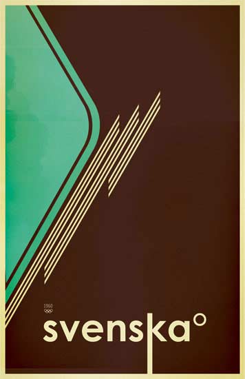
In creating these posters, he went back and did something he only used to do when he was just getting started in design:
“Originally before I had any clients or specs I would just make up stuff, like imagine some event or some album cover that never existed, and just make something based on that spec just for the fun of it to learn Photoshop and all that, and it’s like, I really like getting back to that, where even the word means nothing basically, it’s pretty arbitrary”
And:
“This was just a great chance for me […] to really just open up and do exactly what I think is cool and make something that’s just supposed to look cool and not supposed to really communicate anything at all… and at the end of the day, it does communicate something. It’s always gonna communicate a vibe or kind of an aesthetic that people are gonna get something out of it in that way but it doesn’t say a time or a place or a date or anything like that”
I really like this aspect of Scott – that he’s able to just play like that and really just forget about serious stuff for a while. Thumbs up – also for the technique. I’ve tried it myself a couple of times, and it’s really liberating. Highly recommendable :)
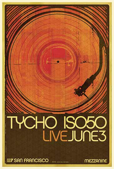
And then he moved on to showing us the construction of on of his actual PSD-files (for the show poster “WAX” as seen here below). Mastery to its fullest!
==========[ END OF SEMI-TRANSCRIPT ]==========
After the workshop there was a raffle graciously sponsored by Adobe and Gimlet. Anders won CS3 – Design Premium during this raffle! Lucky bastard you :p
[ 20:30 ] Mingling and exchanging business cards. Looking at the poster sale. I gave a present to Scott and his brother Dane to say thanks for the workshop (typical danish cheese with a custom label on it, which I printed along with my business cards. Pretty much the same style too. Re-used the same background for that).
[ 23:06 ] Outside Clarion Hotel grabbing some fresh air and talking about the workshop. We’re gonna grab some food and then head back for the hotel to join the others once again.
[ 23:30 ] Ate at a burger bar. Suddenly Scott, Dane, Marcus and his brother Christian walked in the door. Anders was like: “Here they come” and I was like: “What the fuck“. I totally didn’t expect that, but what an awesome surprise! I got to hang out at a burger bar with the one artist that I admire the most in the world. And on top of that, the moment has been preserved for the future through my LC-A+ camera which just so happened to have an ISO50 film in it. Great stuff :) Can’t wait to have that photo developed. I sure hope it comes out crisp and not blurry. Fortunately I had the flash going.
Here it is (added Feb 6th):

From the left: Christian, Marcus, Me, Anders, Scott and Dane.
[ 03:40 ] Waiting for the Flygbus to go to the Airport. Our flight leaves at 15:30, but we’re planning on finding somewhere to sleep at the airport. Forgot my hat when we took a leak. Ran back for it, even though the driver told me he was gonna leave for Arlanda no time weather I was on the bus or not. So yeah, I ran pretty fast to get my hat! Fortunately it was there and I got back on the nus as fast as possible.
[ 04:00-ish ] Bus leaves for Arlanda. Getting some sleep. My back is really killing me.
[ 05:00-ish ] Arrival at Arlanda. We were lucky to find some fairly soft benches to sleep on. Slept there for about 5 hours and woke up at around 10:00. Drifted around the airport for a while until we found some soft seats with a great view of flights taking off. Sat there and took care of some stuff: gathered all the receipts from the trip and stuff like that. Tried to check-in by myself a couple of times at the automatic check-in system, but got refused. I thought I might have done it too early as there was still a good 3 hours until take-off. A while later, Anders tried to check in the same place, but still got rejected by the machine, so he was asked to get behind this huge line and wait for the ticket to be handled manually by the people behind the counter. We were running out of time though, but all of a sudden Anders was told to go to gate-whatever, and he came back to me and told me xxxx and then we packed everything up and ran the best we could towards the gate to check in. That was über stressful…
[ 15:30 ] Take-off.
[ 16:58 ] Kastrup. Bought tickets for Kolding but jumped off at Copenhagen Central Station to grab a quick bite at Burger King. Anders swore never to eat there again. I must admit it was pretty shitty. The fries were slobby (slobbier than usual) and my burger tasted pretty funny… Funny as in “not so funny”.
[ 19:53 ] In the train to Kolding. Watching Family Guy – Blue Harvest. It was ok, but not what I’d expected. Still, I’m looking forward to the nex episodes of their Star Wars parody.

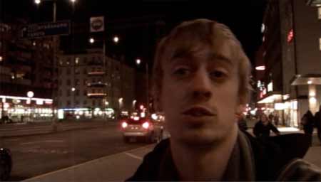
[ 22:30 ] Final update at home before going to sleep in my very own soft bed :D
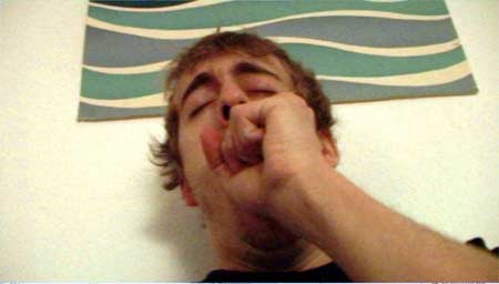
Go ahead, count the hours without (quality) sleep! I dare you. From Thursday 09:00 am to Saturday 22:30 pm :D
—
Check out the documentary I put together right here!
Oh, check out the epilogue on Scott’s blog.
Once again: Thanks for the warm welcome at the workshop :) And good luck with the future events!


 Tillykke Line


Pingback: ISO50 - The Visual Work of Scott Hansen » Blog Archive » Joaquim Blogs The Workshop