


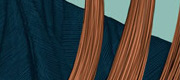
A close-up of the construction. At this point I still need to optically adjust the horizontal lines (make them slightly thinner).
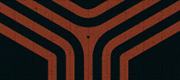
Last summer I went to Spain with my girlfriend. We visited my family and had a really great time. My cousin Estel introduced me to her boyfriend who runs the company Dunatech. I told him that I was working with graphic design and gave him my business card. Later on he contacted me, asking me if I could make him a logo for his company along with a mock-up for the website. This is the logo that I came up with.
The concept behind the logo is kind of basic. I wanted it to have this “techy” vibe to it without exaggerating it. Furthermore, I focused a lot on differentiating “duna” and “tech” and then bring them back together again through the diagonal line that runs through the a and t. I also made a design manual to ensure that the logo is treated the right way. Please comment :)
 Tillykke Line


4 Responses to Dunatech Visual Identity