ON SALE: Be sure to get your hands on this unique poster crafted by designers Anders Baden Nielsen and Joaquim Marquès Nielsen from the Danish design studio Barq. Worldwide shipping available. Visit the webshop. So how does it look “in-hand” or “on-wall”? Here are some of the people who’ve already bought the poster! Enough said! Now to the actual post…
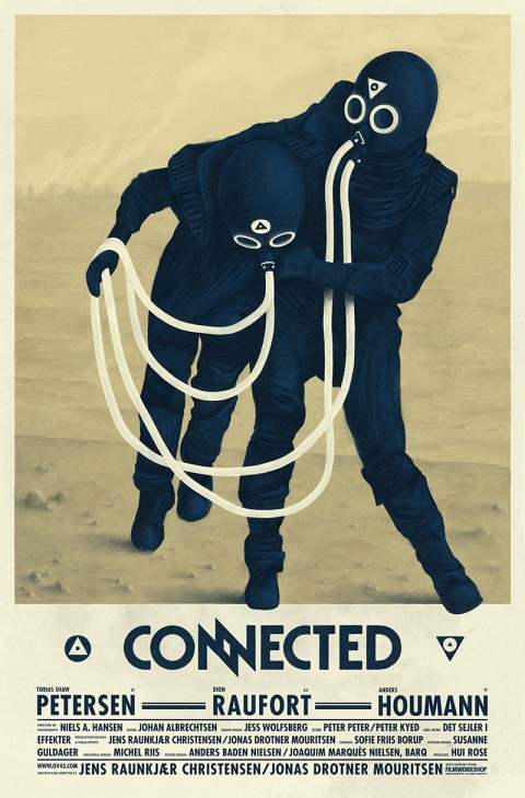
This is the final poster. Below you'll find a description of how this 70 x 100 cm print was created.
Not too long ago, Jens Raunkjær Christensen and Jonas Drotner Mouritsen finished the short movie Connected. In connection with that (pun intended) they asked my friend Anders Baden Nielsen and myself, if we would design a poster for the movie. Since they’re good friends of ours and because the project seemed quite interesting, we said yes.
Connected is a wordless sci-fi-tale following two human figures dressed in protective suits, travelling through a desolate apocalyptic wasteland. They are deeply dependent on each other, since their breathing is shared through two hoses connecting their helmets. As the journey continues they are slowly weakened. In the distance a stranger is is watching their desperate battle, and an unpleasant surprise is waiting.
Brief
The project brief was pretty straightforward: Create a movie poster for the short movie Connected. The poster should share some of the characteristics of old sci-fi and horror movie posters from the 70’s, but with a modern touch.
Inspiration
So, we embarked on the great journey! We searched the Internet far and wide for old posters, and ended up with a nice little library of images to browse through for inspiration. WellMedicated has put together a nice collection of old posters for inspiration entitled 100 Illustrated Horror Film Posters (part 1 and part 2). Among the many posters we found, we especially took interest in the following:
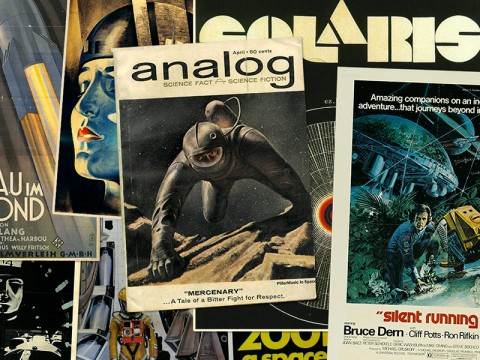
SOLARIS (really nice custom type on this one). Frau Im Mond (we're loving the shading and texture on the rocket). 2001: A Space Odyssey (lovely typography). Metropolis (also nice texture / shading going on here). Silent Running (nice format / layout). And last but not least the analog illustration. It's got that perfect grainy look that we love so much.
Concept development
Jens and Jonas shared with us some ideas they’d been talking about prior to contacting us about the project:
- In the movie, the two main characters each have a unique symbol on their helmet: a circular symbol and a triangular symbol. The idea was to create a really simple and iconic poster based on these symbols (clean geometrical shapes is so trendy these days, right?).
- The second idea was to make a really technical poster/construction drawing of one of the helmets – lots of outlines, numbers and technical stuff basically.
Both were good ideas, but to bring even more ideas to the table, we sat down and brainstormed further. I made some sketches to visualize our thoughts, and to get a sense of what might work – sort of like tuning in on the best idea.
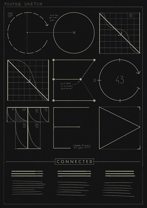
This is a rough visualisation of the "technical / construction drawing" merged with the title of the movie. We definitely saw potential in this idea. The title could easily be divided into three sections and placed on top of each other and still be somewhat legible. I think we abandoned this idea, because ot was a bit too "far away" from the movie. It was too abstract. Well, we might be able to use it in another project perhaps. That's why saving sketches and ideas is so important. Never throw them away!
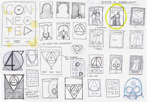
Rather than making large sketches, I found it to be more effective to do these small thumbnail sized sketches instead. It gives you a quick impression of which ideas / layouts might work. The sketch highlighted in yellow was the seed that grew to become the final poster. It's kind of fascinating that a tiny sketch like that can become so much more... Everything has a beginning.
After brainstorming and sketching out various ideas, we had a meeting with Jens and Jonas to agree on which path to take – to select the idea which would become the main concept for the poster. As I mentioned above, we ended up with the concept of having a poster with the two main characters (sketch highlighted in yellow). The idea is simply to show how the characters are struggling to stay on their feet, but presented in a very illustrative way rather than just using a photo (sort of like the Frau Im Mond or analog poster we found during our research).
Format
So now that we had the basic idea / concept for the poster all set, we started talking about which format we should go for. Given the fact that we were going to make a poster heavily inspired by old sci-fi movie posters, we thought it would be suitable to choose a format that would go well with the old look – something that would also contain a bit of storytelling. So we ended up with the classical 1-SHEET format:
Generally measuring approx. 27″x41″ in a vertical format, this is the most common style of American movie poster and the familiar one still in use in theaters today. 1-sheets generally have one vertical and three horizontal folds [source].
Illustration
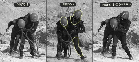
Jonas had taken a lot of photos from the location in which the film was shot. I browsed through all of them, looking for a shot where the two main characters were in just the right pose. I found a photo that came pretty close to what I had in mind, but there was still something missing. I liked the overall pose of the person to the left, but I really wanted the other person to look up, and also change his leg somehow. I browsed through the photos again, looking for “replacement” body parts. (Grotesque I know!) Also, the tubes were way too cluttered and chaotic, so I had to clone them out and make custom tubes which were more visually suitable for the poster.
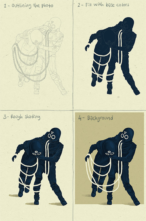
Photohop: Outlining / rough shading the characters for further work in Corel Painter 11
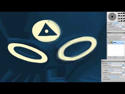
You would think that the illustration consists of several layers, when in fact there has only been one. Only in Photoshop did I have more layers, and that was to separate the outline from the rest. The reason for this is quite simple: My MacBook Pro wasn’t powerful enough to pull the huge document. I tried adding a layer in Painter to separate some of the elements, but the moment I added one, brush strokes would begin to lag. Well, I actually think it was kind of liberating not having to think about layers all the time while working on this illustration. Only in the end when we had to color grade everything, did I wish for layers.
Typography
Along side working on the main illustration, I was brainstorming and sketching out ideas on how to present the title Connected. Question: A modification of Futura or a completely customized title / logotype? We end up going for the modified Futura:
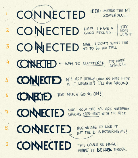
As you’ll notice above, the title has undergone a transformation from plain Futura (1), a really modified Futura (6) to a version where it’s basically only the two N’s that are modified (9). It was a challenge to get the T just so it wouldn’t create too much white space around its base. Also, the C’s and the E have been shortened a bit, too be able to bring it all closer together.
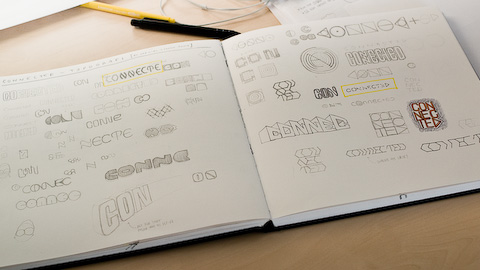
Various skethces on the title.
The placement of the title was really bugging me. I couldn’t seem to make it fit at the top of the poster. I tried numerous things, but nothing seemed to be working. Eventually I reached a point where I thought to my self: “OK, having the title at the top is out of the question!“. So I moved it down above the credit list, which seemed to be working out. It allows the illustration to breathe and it also seems more structured to reserve the bottom area of the poster for the type and the top part for the illustration.
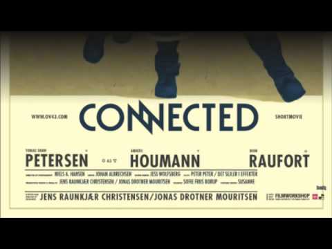
My good friend and colleague Anders was working on the credit list for the bottom of the poster. He browsed through our collection of old movie posters, and printed the most inspirational ones for reference. We wanted to keep the white space at the bottom of the poster as low/short a possible. Consequently, the typographical playground was sort of limited down there, and it became a great challenge to make all the names fit in. But Anders met the challenge and created a credit list that matched the illustration perfectly, thereby giving the poster a solid foundation on which to rest. The video above illustrates just how much work that has gone into the layout of the credits section.
Workflow
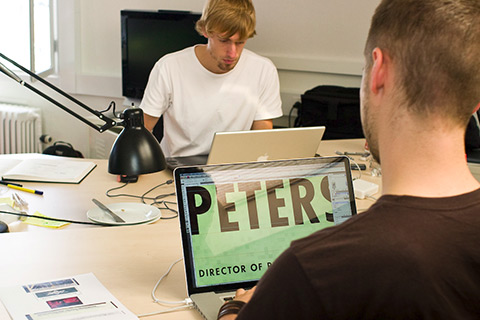
Anders working his magic in InDesign layouting the credits.
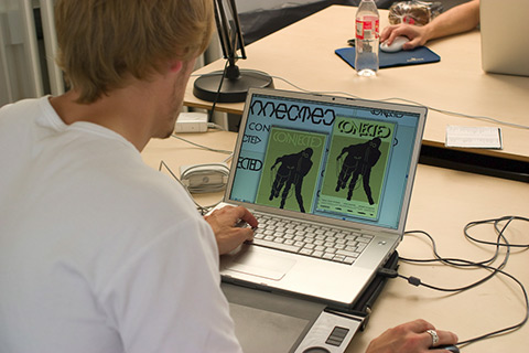
Me trying out various ideas for the title. In this photo we still didn't think about moving the title to the bottom of the poster.
The workflow in this project has been really great. Anders and I each have our area of expertise, and during the time it took to create this poster, we were able to really focus 100% on each of those areas. Anders was working really hard on the credit list while I was illustrating and trying to figure out how the title could be displayed. In my illustration I reserved space for the credit list, and exported a JPEG for Anders to use as reference in InDesign. This worked out really well, and allowed us to be able to work constantly with each our area of design. In the end, Anders exported the layout of the credit list as a PDF from InDesign, which I then placed in Photoshop as a Smart Object to blend it with the rest of the illustration. Since the document was so absurdly large, it would’ve been virtually impossible to work with blending modes in InDesign.
Background
The original idea was to have a single colored background for the illustration, but we agreed that the poster needed more depth, so we came up with the idea of dividing the background into 3 levels: the ground upon which the two characters are standing, the middle part which is more distant and blurry, and finally the sky. We decided to tilt the horizontal lines to give it a more dynamic expression, and to underline the fact that the two characters are struggling to stay on their feet.
I painted some rocks and other “backgroundish” stuff to add some more detail, but also to help balance the poster. The rocks in the bottom left corner of the poster have been placed there to give a little more weight to that part of the poster, slightly counterweighting the massive shape of the person to the right.
Color grading & texturing
We color graded the poster before adding the final textures. Jonas showed me a great technique for masking out different elements of an image: Using the Lightness channel in a LAB colored document, it’s easier to get crisp selections. I won’t go into detail on how it works here, but I might post a video about this technique in the near future. Well, by using this technique, Jonas quickly made separate masks for the following elements of the poster:
- Men
- Tubes
- Background
- Paper
- Sky
- Type
Now that we had separated the elements, we were able to color grade them individually. Had the illustration been layered, we could’ve saved some time here, but as I mentioned earlier my MacBook Pro wasn’t fast enough (I gotta get me one of them MacPro’s for these kinds of projects!). To give you an idea of how large the document was near the end, click here to view the amount of layers. Bear in mind that it’s a 70 x 100 cm, 300 dpi file!
Final details
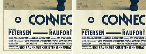
In the early development of the credits, we had a thin frame around the bottom to help stabilize the layout, but in the final stages of the poster we realized, that we didn’t need the frame anymore because of the squareness of the — so we removed it, and instantly noticed how it became less cluttered.
Also, we added a slight outer glow to the typography to make it look less like a placed object, and more like an integrated part of the illustration. Basically the outer glow is adding some anti-aliasing to the edges of the otherwise vector sharp typography. Most people will probably not notice this as the poster is supposed to be viewed from afar, but as designers we just can’t help ourselves — it’s all about the details!
Printing
Jens and Jonas did a lot of research to find the best solution for printing the poster. We visited two different printing companies to talk about our options regarding paper, the amount of posters, transportation and of course pricing. In the end we all agreed on choosing Graphic Source which is based here in Kolding. They seemed to understand exactly the look and fel we were going for, so it just felt like the right choice to pick them for the job.
The decision of using Cyclus Offset 200 g/m2 100% recycled paper was unanimous. This paper just has an amazing feel to it, and the amount of visible grain is perfect. The only downside is, that it’s a bit dusty in the offset printer, which slows down print time (by how much exactly I don’t know).
Cyclus Offset 100% recycled is the ideal product for all general communications; it boasts outstanding opacity, a natural shade, good runnability, excellent press performance and a unique feel and texture. These outstanding qualities are complemented by the environmentally friendly of its manufacture. Cyclus is produced using 100% post consumer de-inked waste.
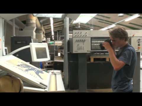
Jonas and I went up to Graphic Source to help assist the printing technician make the final color adjustments. It’s quite the experience to watch a personal design being processed in a huge offset printer like that. The technician was carefully adjusting the various levels of color, pressure and water to get the print just right. Obviously both Jonas and I brought equipment so that we could document the whole offset process. Take a look:
Photos of the printed poster will be posted here as soon as possible.
For more background information about the short film CONNECTED check out this site: www.ov43.com — here you’ll also find additional photos from the poster process taken by Jonas Drotner Mouritsen.


 Tillykke Line


Pingback: Get yourself Connected « Yeah it's Mint
Pingback: Watch the Danish sci-fi western short Connected | Atomic Popcorn
Pingback: DrawingSilence » Archive » Connected – Short Film
Pingback: Connected Poster « The Last Gang In Town
Pingback: Connected – Short film « Yo, what's kicking?
Pingback: The CONNECTED poster (by Barq) « EDUARDO MARQUES HAS A SHITTY MEMORY
Pingback: Process « ric bixter
Pingback: Movie Poster Development | abovebelowcreative